Monday, December 12, 2011

Secondary Research

To better understand my audience it's important to see what existing magazines already have to say about them. Underneath I have presented Metalhammer's and Kerrang's media packs:

Metalhammer


Metalhammer's media is reinforcing my previous thoughts about my target audience. The media pack provides a very fitting description of them:

Providing access to the notoriously unobtainable young male audience, the Metal Hammer reader spends his spare cash on indulging his passion for everything loud. Non conformist and hard to please they desire only the best in entertainment.

Especially the point "hard to please" I think is very important. My audience just want more from a magazine like Metalhammer then for example the audience of Q! or Mojo, but in return Metalhammer will get a more loyal fan base and subscribers. This is something i need to have in mind when designing the magazine.
There was some surprising facts in the media pack as well, especially how much the reader engage in activities outside the music. The "word-of-mouth" factor was higher then I first thought as well, when 93% of the readers will pick up a band from the magazine and share their music with friends.

Kerrang!


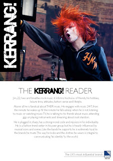
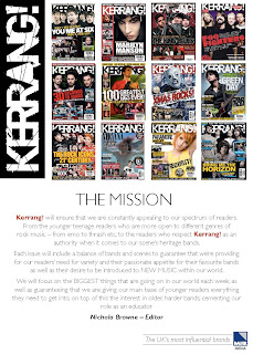
The Kerrang media pack provides us with a very helpful reader profile. Although I think it's a little too passionate and exaggerated. I can imagine magazines like Metalhammer have readers like Kerrang! have described, but Kerrang! is a more "mainstream" magazine, more open towards what's going on in the alternative rock, indie and even mainstream pop music scenes. A greater variety in sales in just the last 10 years indicates that Kerrang! may be an more 'unstable' magazine (because of it's more trend-based approach) then Metalhammer.

The Media packs do fit in very well with the audience I've already imagined doing my previous research. There are some new interesting facts, but nothing very important that I've missed out.

Thursday, December 8, 2011

Photography - Planning

I've decided that the images in my magazine in my magazine is going to be a mix between posed/naturalistic photos out on location, maybe studio photos and live photographies. I have already taken a few photographies to this magazine at a Machine Head gig few days ago, and I'm going to another gig this evening so I will get even more live photos.

I have also found a model for a front cover. I still have to figure out how I want to take this photo though, but I'm pretty sure that I want to take it in a studio.

Other photos I want to take out on location, maybe use a few other models.

Monday, December 5, 2011

Flat Plans

Some early sketches on the composition of the pages in my magazine.

On this content page I wanted to go for a more classic design, then just have a "list" of my magazine contents. In this draft I have four "featured" articles as well as an review and gig section. I think it`s important to have a varied contents page.
This is a relatively simple cover draft witht the name of the magazine placed into the upper left corner and all the features placed on the sides around the cover photo.
This is a draft of an pretty simple contents page, I felt that the design was too "straight-forward" and simple for my magazine and wanted to do some more challenging. I still feel it's safe back-up draft to use.

This is the first draft of my DPS. I feel it's a fairly standard but safe DPS but I added a "timeline" down at the bottom to make it more interesting.

Sunday, December 4, 2011

Pitch

1. 
The magazine I will produce is called Distortion. It will cover most metal/hard rock music and have a more underground approach.

2.
The magazine will cover a lot of the things going on within the metal genre today, it will contain information about bands, interviews, opinions, gigs and festivals, reviews, articles on the history of the genre and cover things within the metal subculture as well.

3.
The layout of the magazine will be clean, with only a certain amount of different colours, and fonts used to make it consistent and maybe not so "messy" as many of it's competitors.

4.
My target audience is largely males 17 to 25 of age. They have generally an interest in the genre and they engage in activities connected to the genre as well. They are a determined audience, they usually know what bands they like or dislike and usually have opinions about the genre. My target audience may span from class D to C1 (working to lower middle class), someone may belong to class B (middle class) as well.

5.
My double page spread will be a brief history of a fictional band and a review of their discography.


Monday, November 28, 2011

Feedback Session

Today we had a feedback session and we went trough each others magazine projects so far and left comments on the work. I displayed my pitch alongside a dummy page that I quickly made in Photoshop. I had few flat plans to show unfortunately.

From the feedback session i mostly got positive feedback. I agreed with most of it, but not that I should have a bigger variety of colors. I think that it's good to have a simple design with less colour then a design with too much colours and too much going on. In the magazines I've researched as well, I found that the colours where limited to max four colours per design.

I agree that I should have more stuff going on within the page. Maybe add some sort of border and small columns of text along the sides. I feel that details like this should come along later in the process.

Stylesheet

Click to get a larger image!

This is the my first idea of how my magazine may look like. I decided to use the colours red, black and white as main colours. I want my pages to be mostly white, but also have some areas where the background is dark grey, with white text. I want to vary the background colour in my magazine to make it more interesting. I want to have a clean design, but also a design that reflects the music and the audience.

Using my stylesheet i made a "dummy page" in the current style of my magazine below (this is NOT how my magazine will look though, just experimentation!):

Click to get a larger image!

The Survey Results

To better understand what audience my magazine really is aimed at, we have been given the assignment of making a closed question survey. The questions in this survey is thought out to tell me more about my audience's reading habits, how and why they are into this kind of music and how it affects them. This will be useful in developing my magazine, tough I can see the challenge in translating these answers into different elements regarding my design. 

This survey was done using SurveyMonkey, the weblink was posted on various music sites as Ultimate Guitar and Metalhammer, and shared numerous times trough the social media site Last.fm. I got over 200 answers, but could only use the first 100 due to the free-account restrictions on SurveyMonkey. Anyway, here is my result:


Before I started the survey i suspected that the majority of people listening to metal music where male, but it was still a surprise to see that 96% of the attendants where male. I don't think that as many of 96% of the people who listens to metal music are male, but it may be that it's most males that are interested in going out on the Internet and reading less known forums and websites about this genre, and then find this survey. This is an important question in my survey because it gives a clear indication of who my audience is.

90% of the attendants in this survey could be found within a 12 years age span from 17 to 25. Along with question 1 this gives us a very specific group of society, simply male 17 to 25. Again I will have to consider that this survey was done on the Internet, and young people probably use Internet a lot more then people that are above 26. 


This is an important question to have in this survey because it tells me if there is a market out there for new magazines. Only 14% of the attendants are subscribing. I couldn't find any information of how many percent of the whole population in the UK that are subscribing to magazines, but I suspect that younger people between the age of 17 to 25 for various reasons decides to buy magazines in a store instead of subscribing. If my magazine is going to rely on people buying it in stores, then the approach of my magazine have to be sightly different from a magazine that relied on subscribers. 


So more of the attendants in this survey are reading magazine, but still a considerable amount of the attendants doesn't buy/read any of the magazines listed. This means that magazines still has a potential to engage with their audience and to capture new readers.

 
The most important thing in a music magazine is of course the music, so there is definitely value in asking how readers access music. What I see is that illegally downloading is still popular but that streaming services and buying Cd's aren't far behind. According to this survey, together the legal purchase of music is bigger then the illegal in my audience. I believe that listeners in the metal music genre to a higher degree engage in activities outside the music. A great deal aren't just "listening" to music, they are playing instruments, writing blogs, read magazines, attend concerts and festivals.  Therefore I believe that a lot are more loyal towards their music and will buy and support their favourite acts (legally purchasing music) instead of stealing from them.

This is also useful to look at with advertising in mind. Advertising usually makes up a huge part of the income of the magazine so it's definitely important. I can see that my magazine definitely will have readers that uses streaming services. So for an example services like Spotify and lesser known services like Wimp will benefit from advertising in my magazine.

Another question, too see if magazines got an impact on the music we choose to listen to. It does, 7% of the attendants said that they discover new music trough magazines. Surprisingly the Internet plays a huge part in what we choose to listen too, but again I have to take into reconciliation that this survey was done on the Internet itself. Friends relatives makes up about a fourth of the answers, and it really is an example of how important "word of mouth" is.
Still, discovering music from magazines, music websites/blogs, and trough streaming services and stores (62%) is largely individually discovering of new music. A listener to the metal music genre likes to find his own music, individuality is important!

This is a tricky question, because magazines tend to make a stand every time a new band pops into the more mainstream, public eye or a new wave of music is emerging. Like Kerrang! embraced Nu-metal acts in the late 90's, Rolling Stone dismissed The Beatles in the 60's. Does the opinion of magazines really matter to us? According to the attendants of this survey it doesn't, and it reinforces my previous statement of that individuality is important to my audience/attendants of this survey. Magazines do have an impact though, but what I think is more important is that a magazine should be able to reflect the music taste of it's audience as much as they can. So if Rocksound is going to place dubstep/dance artist Skrillex on it's front cover, then the editors of Rocksound has to be sure that their readers actually likes Skrillex.

The answers on this question came as a surprise as me, as i didn't think it would be as many as 88% of my attendants playing an instrument. Along with question number one, it gives me some very concrete information about my audience. They are almost all between 17 and 25, and almost everyone is playing an instrument. No wonder why there is a lot of advertising in music magazines for instruments. The answers on this question reinforces my statement of that my audience is largely engaging in activities outside just "listening" to the music.

The most exiting question in my survey. The magazines itself surely hasn't any big impact on personal believes and choices of my audience, but the music itself has! Only 7% of my attendants answered that the music has no impact at all, so I conclude that the music and things close tied to the music has a lot to say for my audience. They get unhappy if the magazine aren't exact on details, messes with their favourite band or go "mainstream", but a music magazines will maybe get more royal readers, and over times these magazines get a lot of reliability and respect. Kerrang! have been going since 1983 and Metalhammer since 1985, so we talk about really "old" magazines still relevant in the media world!

Saturday, November 12, 2011

Magazine 2 - Rocksound


General Information.

- Founded in 1999
- Aiming to be more underground and indie.
- Published by Freeway Express Inc.
- Circulation: 15, 000.


Colour Scheme


Rocksound uses a lot of different colours in their design. Blue, yellow, red are the most used colours, but the magazine also features colours like green and purple. These are very "playful" colours, and it tells us immediately that Rocksound is aiming towards a younger and more playful audience. In compare to Metalhammer, that is more serious, tougher and mature, Rocksound is younger, fresh and playful.


Photography

Rocksounds pictures is for the most part studio pictures taken exclusively for the magazine or they are normal press-photographies. Rocksound has a open-minded, young audience. So it's important for them to feature a lot of new bands. The photographies itself are usually neutral or even portrayed with an high angle. It's important to Rocksound to make the bands seem as natural as possible, to make it easier for the audience to connect with them.


Writing Style

Rocksounds language is more gently and serious then for example Metalhammers. What's interesting is that Rocksound doesn't use a "young" language in their articles. The language is actually quite formal and analytical despite the youth approach the magazine has.
Rocksound is a monthly magazine, so they have the time to make longer and more articles. Rocksound definitely focuses on making a lot of articles. Although they have fewer pages then Metalhammer, they have more articles and they are featuring more bands.
In the review section I think we really get an essential part of Rocksounds image.  The review section is long, and it features a lot of bands. Rocksound is a relatively new magazine, compared to most other music magazines. Because they are "new" it's very easy for them to relate to "new" music. Most of the music in Rock Sound consist of young, usually British bands making their best music now instead of older magazines like Metalhammer which tend to also focus on old bands.


Text/Picture ratio

Rocksound definitely features more pictures then text. In many articles the text is actually written over a picture. Rocksound is a very visual magazine, it makes it at once more exiting to a younger audience, but may seem a little messy and less serious to others.


Fonts

Rocksound uses very clean fonts throughout the whole magazine. Rocksound is not a "metal" magazine like Metalhammer, and this shows on the fonts they have chosen. The simple, sightly retro fonts used for the cover lines are especially a thing about Rocksounds design that makes it "non metal" and maybe more accessible for listeners outside the genre.


Overall Look

Rocksound is a strange magazine. Visually it's colourful, young and childish, but when you start to go in depth in the articles and the language it's mature, serious and even analytical.  Rocksound have managed to have this unique combination of being relevant, young indie and yet a mature magazine. The audience of Rocksound may be teenagers and young adults, but obviously thinking teenagers and young adults. It's also good for the magazine's part. Because they aren't to contemporary, so they doesn't "lock" themselves to a certain music phenomena or wave. 
Maybe the most interesting thing about this issue of Rocksound, the dubstep, dance artist Skrillex on the cover. It reinforces Rocksound as a youth magazine, not necessarily locked to one genre of music.

Magazine 1 - Metalhammer

Cover.
General Information

- Founded in 1986.
- Considered the ‘underground’ magazine to competitors Kerrang! and NME.
- Published by Future Publishing.
- Circulation: 41, 800.

Colour scheme

Metalhammer usually contain the colours red, white, grey and black. And it’s the same red colour (#a23823) for the whole magazine. Although this varies as we go into the longer articles/interviews. Metalhammer uses these colours because it’s typical 'metal' colours, and an important part of Metalhammer’s trademark is to 'stay metal'. Since Metalhammer got a less mainstream approach it’s important to apply to the underground audience, and the underground audience often expect magazines like Metalhammer to be conservative and reflect them.


Photography

Metalhammer got a mix between studio, location, archive and live photographies. In small articles, reviews and notes there are more natural posed archive photographies, but in the longer interviews and articles, Metalhammer have been consciously deciding location, setting/costumes and pose. Often the photographies in the longer articles are building up under the image of the band. There is a long article about the band Slipknot, which features them in a series of relatively dark photographies. Another example is an article about Manowar, which only consists of live photographies. Live shows is a thing that a metal fan would associate with Manowar (they actually hold the world record of the longest concert ever). Again, Metalhammer is displaying this "we give you what you expect" attitude towards their readers. They know this genre of music, and so do their audience.


Writing style

Metalhammer is a monthly magzine, so in compare to weekly magazines like Kerrang! and NME, Metalhammer contain longer and more articles and a long review section. This also makes Metalhammer a more relaxed magazine, and it doesn't rely so much on fresh news like Kerrang! and NME. I have mentioned the "we give you what you expect" attitude already, this is clearly displayed in the writing style. The themes in the articles is often this "be yourself, do what you want" rebellious individuality, and it reflects this genre music itself.  The language is quite informal, relaxed and sometimes uses a lot of expressions and words associated with the genre. (as the numerous of sub-genres in metal). 

Text/Picture ratio

in Metalhammer there is a lot more text then pictures on the "normal pages", but when we move into longer articles there is larger pictures, sometimes covering a whole page or even a double page spread. In the longer interviews/articles Metalhammer often opens the article with a huge picture on a double page spread. This makes the article seem more "epic", "huge", interesting and serious. 


Fonts

Metalhammer uses a thick stencil font to headlines, but a thin Arial in the main text. This reinforces the magazine's "tough" look, without damaging the readability. 


Overall Look

Metalhammer has a tough look. Every element of the magazine, language, pictures, colours, layout and the overall design is tough, but it doesn't make the magazine unreadable. Metalhammer reflect this genre of music very well. The colours for an instance, is the "metal" colours, red white and black, colours. It’s a magazine that focuses on being connected with it’s audience, not making big changes in layout or which bands they would like to cover.